Tip Tuesday - Back to Black
 |
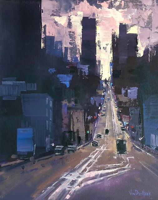
| "Night Ride" Oil on 9" x 12" Arches Oil Paper. Sold. |
Last Tip Tuesday I talked about how to break the white addiction, in all fairness this week I'm going back to black, as Amy Winehouse might say.
Do your darks look lifeless? When creating a shadow color are you adding black to darken the value? Black can kill the hue in your paint mixtures. Which is fine if that's a deliberate choice, but if you're simply looking to darken a color try using something besides black such as Ultramarine Blue, Alizarin Crimson, Dioxizine Purple, Pthalo Blue or a combination of these.
Black is a color. This might seem like and obvious statement but black is often misused and like a rebellious child, it is often misunderstood.
Unless you're using a truly neutral black, like Gambin's Chromatic black, then you should treat black as you would any other color on your palette. First figure out which way your black leans, is it warm or cool? For example, Mars black tints warmer than Ivory black. This is important if you want to be able to figure out where and when to use it.
Mars black is always on my palette. As a landscape painter I find it incredibly useful when mixing greens. It's a good shortcut to get to gray quickly, however, I usually add additional colors to it because gray in a landscape is rarely neutral.
While it's always on my palette, it is one of the few colors I feel is optional. So if you struggle with lifeless dark values or grays, try adding other colors to it or leave it off your palette until you have more experience mixing color.

Comments