Tip Tuesday - How to Break Up With Your Photo Reference
 |
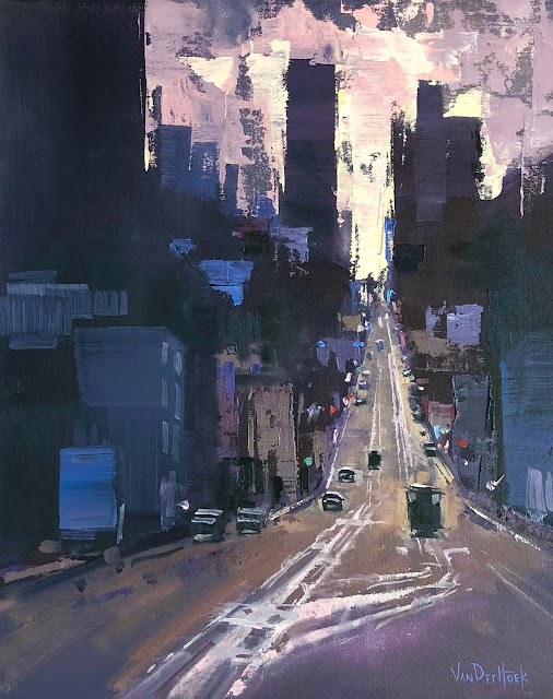
| "The Maze" Oil on 24" x 24" panel. Sold. |
You found it, it's perfect, that scene, vista, photo - is a joy to behold, so surely it would make an awesome painting, right?
Before you pick up that paintbrush ask yourself a few questions.
 |
| Detail 1 |
2) Where is the horizon located?
3) Is there a hierarchy of shapes?
4) What do the negative shapes look like?
5) How much do you love the local color?
Aw man...but, you really want to paint right now and worry about all that boring stuff later because maybe, this time magic will pour from your brush and a beautiful painting will emerge right?
Um yeah, you might want to rethink that last bit because unfortunately, beautiful paintings don't just happen. They require thought, planning, lots of decision making and even some luck.
Before I start a new piece I ask myself all of the above questions and more. I try to identify problem areas and deal with them in the planning stages instead of when I'm knee deep into the painting process. It makes painting a lot more enjoyable and sets me up for success in the early stages (besides, I'm sure to make a mess of things later anyway).
What should you look for?
1) Know which direction the light is coming from and stick to that plan especially when painting outside. There will be times where you'll find that knowing which direction the light is coming from will help you render the form of a tree or building that you don't have a clear view of.
 |
| Detail 2 |
3) There needs to be a dominant shape in a painting. If you give equal emphasis to every object in terms of size and spacing then once again, your main idea will be sacrificed as a result.
4) Yes, those flowers/buildings/trees are a lovely shape but, what do the spaces between things look like? As with positive shapes, negative shapes should also have a hierarchy and follow similar guidelines in terms of size and spacing. It's really easy to be dazzled by the positive shapes in a scene and completely ignore what the negative shapes are doing, and they are just as important.
 |
| Value and Composition Sketch |
My point today is this - before you go in front of the justice of the peace and find yourself eternally chained to your reference - think. Remember, no one will see the reference you used when they view your painting. So get creative, don't be a slave to your reference, that's your job as an artist, to push beyond what is in front of you. Besides, you might be surprised by the results.
Believe it or not, the painting above did not match the scene I was looking at when I painted it. The view I was seeing was very bright and had a full range of local colors. I made the conscious decision to abandon the existing color and only use the view as a reference for shapes and values. In the end, it made for a much stronger statement.
Happy painting!

Comments
Patricia